Every hospital has encountered this problem – a patient wandering the halls trying to find radiology and about to lose their patience. Remember when the issue was addressed with different colored feet glued to the floor? Today each project should focus on wayfinding and navigation for patients. What are the possibilities to improve wayfinding, beyond signage, for a small addition or a larger addition/renovation project?
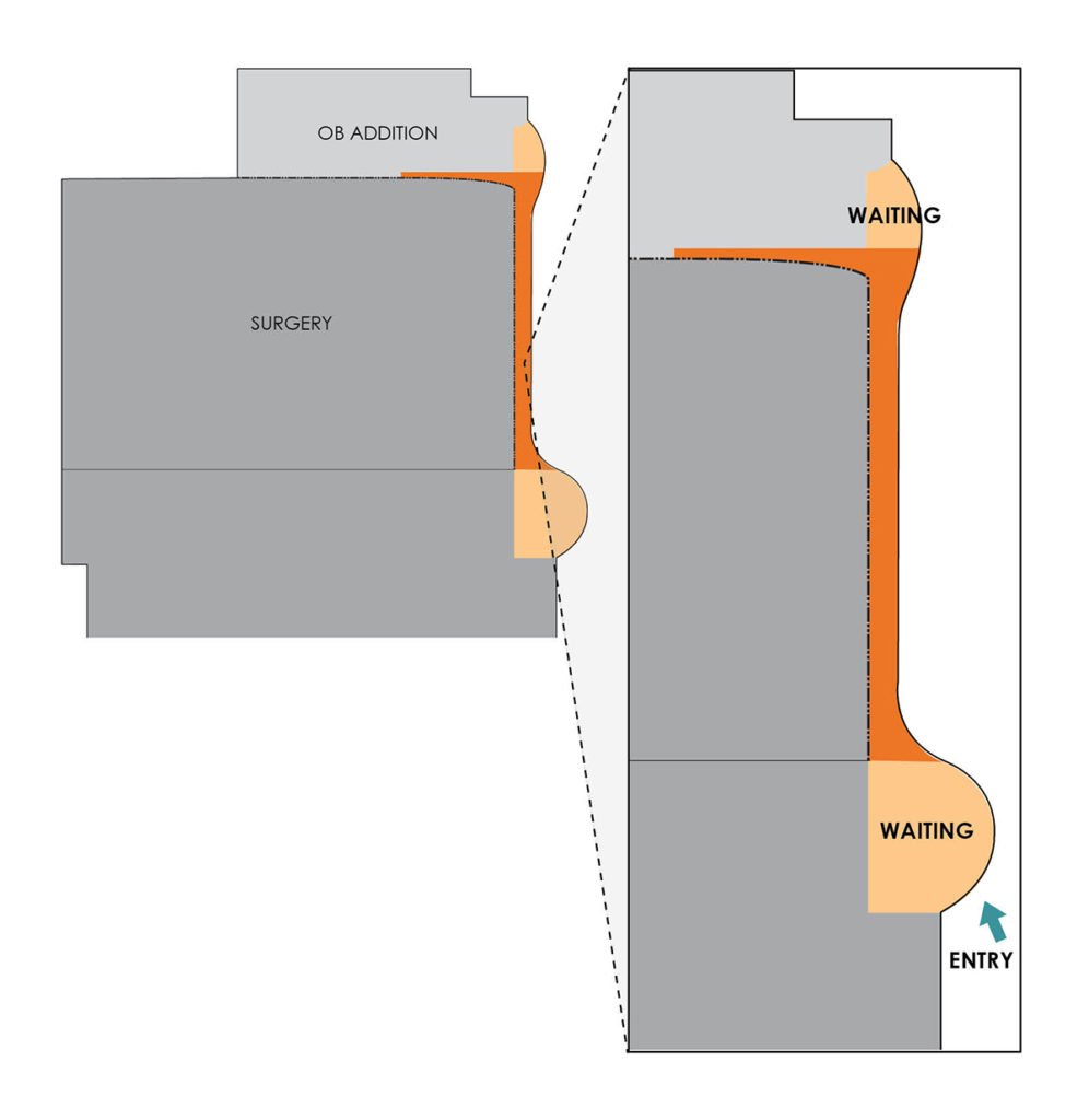
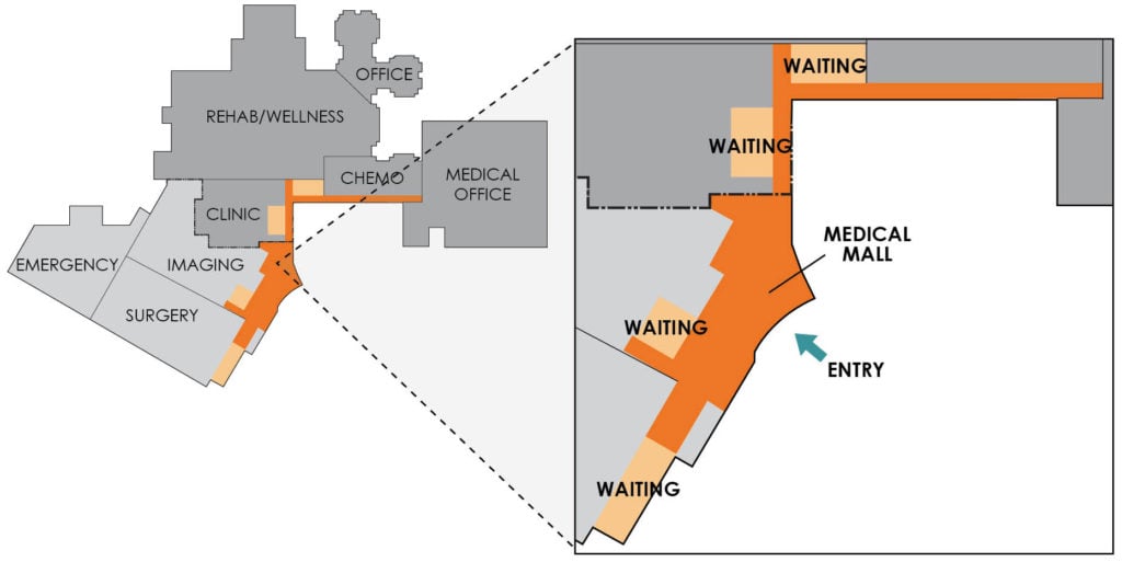
Spencer Community Hospital (Spencer, Iowa) started to think about a renovation of the existing OB department and quickly came to the conclusion renovating would not meet their needs. An existing hall, down another hall, off the main entry lobby, was studied as a path to get to an addition but mixed patient and surgery traffic. A corridor added to the exterior, directly off the main lobby, was studied and preferred by the hospital for ease of access. The new Birth Center became a focus of the entry. Not only is it easy to find, but everyone entering is reminded of the great facility.  Box Butte General Hospital (Alliance, Nebraska) decided to construct an addition doubling the size of the hospital to include a new entry, surgery, emergency, and imaging. The challenge was to provide clear wayfinding rather than a myriad of corridors between old and new. One main corridor was located at the exterior of the addition and connected directly with the corridor in the original building. Easily found waiting areas for surgery, imaging, specialty clinic, chemo, and wellness are all placed along a “Medical Mall.” Natural daylight floods many of the waiting areas, especially surgery where visitors sometimes have the longest waits. Color is also used to differentiate the various areas for clear wayfinding.

As hospitals provide more and more services, ease of patient and visitor traffic flow will continue to be at the forefront of healthcare design. Natural daylight, color, signage, and easy-to-find waiting areas all contribute to great wayfinding.


