


In September,
we explored color trends and their influence in the workplace. With 2018 in full swing, we wanted to dive deeper into color and how it impacts the spaces we design and occupy. And what that can mean for you.
 Every year
PANTONE® declares a “color of the year.” For 2018, they have declared
Ultra Violet to be that color. The PANTONE team notes that “The color is often associated with mindfulness practices, which offer a higher ground to those seeking refuge from today’s over-stimulated world.” That got us thinking. How does color impact building design? We often think of the exterior as setting the stage for what’s to come on the inside. It’s the public’s preview of what they can anticipate when they walk through the front doors, but does color really matter in when you’re designing a building?
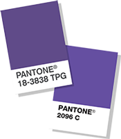
Every year
PANTONE® declares a “color of the year.” For 2018, they have declared
Ultra Violet to be that color. The PANTONE team notes that “The color is often associated with mindfulness practices, which offer a higher ground to those seeking refuge from today’s over-stimulated world.” That got us thinking. How does color impact building design? We often think of the exterior as setting the stage for what’s to come on the inside. It’s the public’s preview of what they can anticipate when they walk through the front doors, but does color really matter in when you’re designing a building?
Color of the Year
Every year
PANTONE® declares a “color of the year.” For 2018, they have declared
Ultra Violet to be that color. The PANTONE team notes that “The color is often associated with mindfulness practices, which offer a higher ground to those seeking refuge from today’s over-stimulated world.” That got us thinking. How does color impact building design? We often think of the exterior as setting the stage for what’s to come on the inside. It’s the public’s preview of what they can anticipate when they walk through the front doors, but does color really matter in when you’re designing a building?
The Potential Impact of Color on Mood
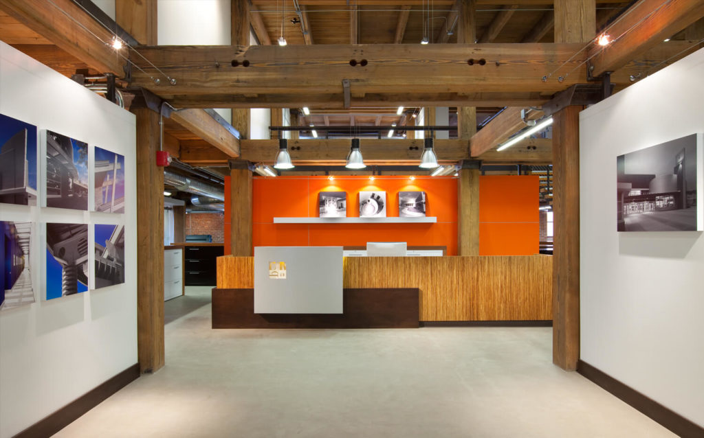
According to Kaplan Early Learning Company, color can enhance learning and influence the mood of people. They cite Pam Schiller, PhD and note the potential impacts of color on people: red can encourage creativity; yellow creates a positive feeling; and orange increases alertness. Additionally, both green and purple are thought to create a sense of calm, while brown helps promote feelings of security and relaxation. And those “boring” off-white walls? They help maintain attention and can also lead to positive feelings. The overall consensus is that color within a building absolutely has an impact on employees and others who utilize those spaces. And on all of us in our home and work environments.